🖼️ Composition
The rule of thirds in landscape photography (and when to break it)
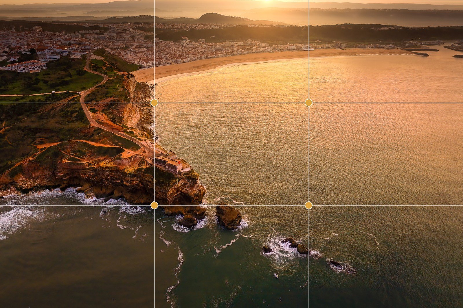
The rule of thirds is the first composition rule most photographers learn — and the one most repeat as a slogan without ever asking why it works. Learn it as craft instead: understand what the grid does to a viewer's eye and you'll know exactly when a dead-centre frame beats it. It's a tool you reach for on purpose, not a law you obey.
The rule of thirds is the most repeated piece of composition advice there is, which is exactly why it’s worth understanding properly rather than parroting. It isn’t a magic formula and it isn’t a law. It’s a reliable starting point for arranging a scene so the eye has somewhere to go — and once you see why it works, you’ll spot the moments when ignoring it makes a stronger picture. This is one of the most learnable parts of the craft, because the principle is simple and the payoff is immediate.
The grid, and what goes on it
Imagine two evenly spaced horizontal lines and two evenly spaced vertical lines laid over your frame, splitting it into nine equal rectangles — like a noughts-and-crosses board. That’s the rule of thirds grid. The advice is short: place your important elements on those lines, or — better still — at one of the four intersections where a horizontal line crosses a vertical one.
Those four intersections are often called the power points. They’re the spots where a viewer’s eye naturally settles first, so anything you put there gets noticed without effort. A lighthouse, a lone tree, the brightest break in a stormy sky, the sun itself — drop it on a power point rather than in the dead centre and the frame immediately feels more considered.
The key word is off-centre. The whole technique is a structured way of not parking your subject in the middle of the frame.
Why off-centre beats dead-centre
A centred subject is stable to the point of being inert. Your eye lands on it, registers it, and has nowhere else to travel — the picture is “solved” in a glance. That works for some images, but for most landscapes it reads as static and a little lifeless.
Off-centre placement does three useful things at once:
- It creates balance with a hint of tension. A subject sitting to one side leaves open space on the other, and that asymmetry is what makes the frame feel alive rather than rigid.
- It gives the eye a journey. Space to one side invites the viewer to move across the scene — into the foreground, along a shoreline, toward the light — instead of stopping dead on the subject.
- It reads as dynamic. The same mountain feels like it has more energy at a power point than dead-centre, even though nothing else changed.
None of this is mysterious — it’s just how we look at pictures. The grid is a shortcut to placements that respect that instinct. For the wider toolkit it sits inside — leading lines, depth, framing, negative space — see our guide to composition for landscape photography.
The horizon: the landscape photographer’s first decision
In a landscape, the single most common thirds decision is where to put the horizon — and the most common mistake is splitting the frame in half. A horizon dead through the middle hands equal weight to land and sky, which usually reads as indecisive rather than balanced. Pick a winner instead:
| Where the horizon goes | When to use it | What it says |
|---|---|---|
| Upper third | The land is the story — a strong foreground, reflections, detail underfoot | “Look down here at the scene” |
| Lower third | The sky is the story — dramatic cloud, sunset colour, a big open mood | “Look up at this sky” |
So a wildflower-strewn foreground leading to distant peaks wants the horizon high, on the upper third, giving most of the frame to the land. A blazing sunset over a quiet sea wants it low, on the lower third, handing the frame to the sky. Decide what your subject actually is, then give it the larger share.
One technical note worth folding in here: that strong, close foreground only delivers if it’s sharp from front to back, and that comes from a small aperture (a high f-number such as f/11–f/16) paired with hyperfocal focusing — focusing roughly a third into the scene so the depth of field stretches from near to far — or focus stacking several frames when even that isn’t enough. A wide-angle lens, which photographers reach for precisely to make a foreground dominate, exaggerates that near object dramatically — so getting it tack-sharp matters all the more. Composition and sharpness are decided together.
When to break it — on purpose
Here’s the part the slogan leaves out: deliberate centring and symmetry are powerful, and some of the strongest landscapes ignore the thirds grid entirely. Break it when the scene rewards it:
- Perfect reflections. A glassy lake doubling a mountain wants the waterline dead-centre, so the real and mirrored halves match exactly. Thirds would spoil the symmetry that is the photo.
- Formal symmetry. A tree-lined avenue, a symmetrical building, a road vanishing straight to the horizon — centre it and let the order do the work.
- A lone subject isolated for impact. A single tree in a snowfield or a boat on still water can hit harder placed dead-centre, surrounded by negative space, than nudged to a power point.
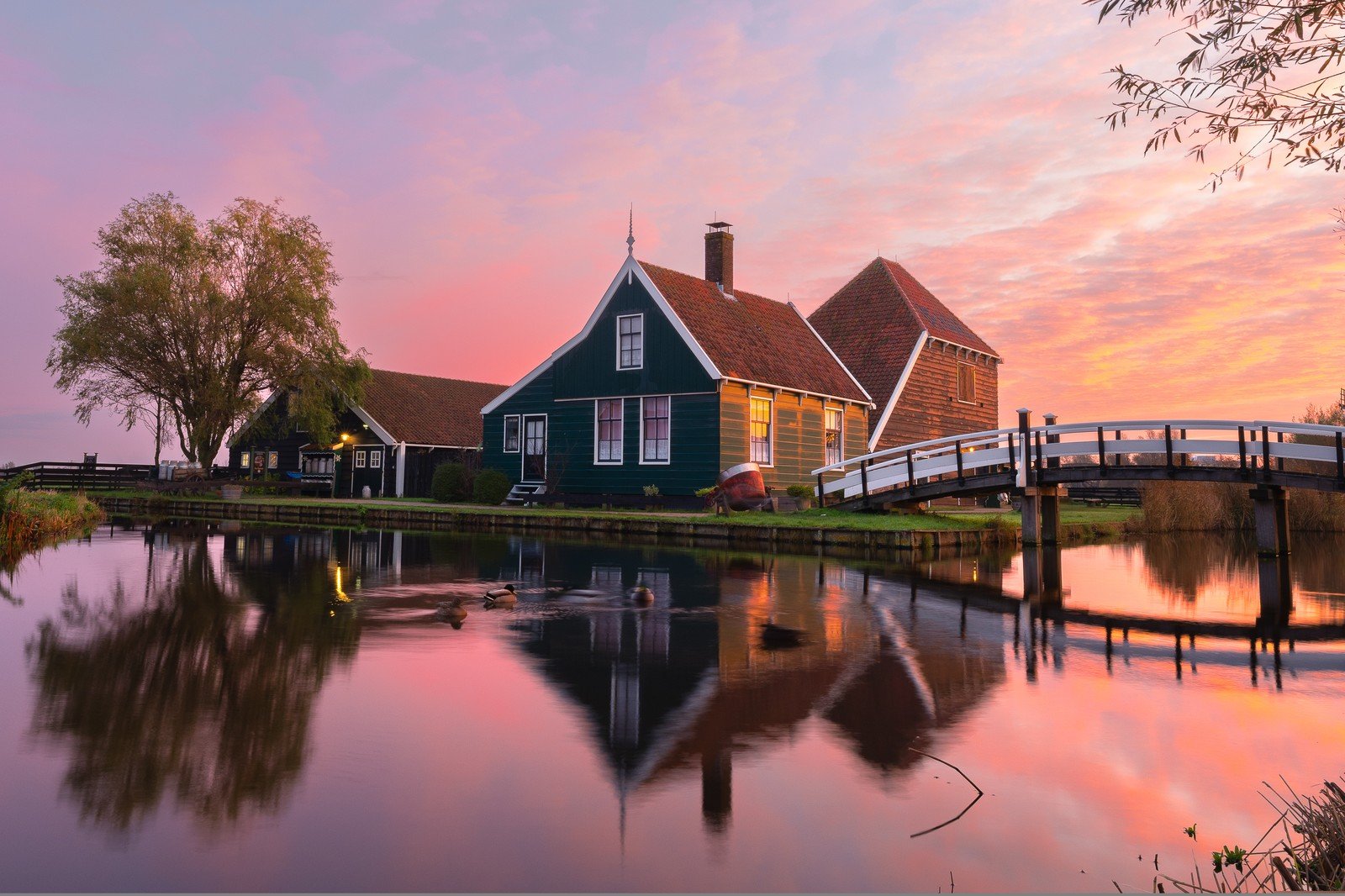
The test is always why. If centring serves a clear idea — symmetry, stillness, deliberate confrontation — break the rule without hesitation. If you’re centring out of habit, the grid will usually rescue you. Knowing the principle is what earns you the right to ignore it.
Train your eye in the field
You don’t have to judge thirds by feel. Almost every camera has a thirds grid overlay for the viewfinder or live view — switch it on and leave it on while you’re learning. Seeing the lines drawn over the real scene trains you to notice placement, and after a while you’ll compose to them automatically and won’t need the overlay at all.
The deeper habit is treating composition as something you work on location, not in front of a screen afterward. Walk the spot, try the horizon high and low, shift left and right to move your foreground anchor onto a line, and watch what each version does to the eye. Scouting the frame in person — before the light peaks — is where the photograph is actually made; the right composition is often the one you discovered by moving. The app’s job is to get you to the right place at the right light so you can spend that time framing rather than guessing. New to all this? Start with getting started.
Quick-start checklist
- Turn on your camera’s thirds grid overlay and keep it on while you learn.
- Put key elements on the lines or at the four intersections (the power points), not dead-centre.
- Place the horizon on the upper third for a strong foreground, the lower third for a big sky — never split the frame in half.
- For a dominant foreground with a wide lens, get front-to-back sharpness via a small aperture plus hyperfocal focusing (or focus stacking).
- Break the rule on purpose for reflections, formal symmetry, or a lone subject isolated in negative space.
- Compose on location — walk the spot and try several framings before the light peaks.