🖼️ Composition
Composition for landscape photography

A strong landscape photograph almost never happens by accident. The arrangement of the frame — where the eye enters, how it travels, where it rests — is a set of decisions you can learn to make deliberately. Treat the classic guidelines as tools you reach for on purpose, not rules you obey, and your hit rate climbs fast.
Most composition advice gets handed down as a list of rules, which is exactly the wrong way to hold it. The rules are really just descriptions of how a viewer’s eye behaves — where it enters a frame, what it follows, where it gets stuck, where it finally settles. Once you understand the behaviour, the “rules” become a toolbox. You pick the tool that solves the problem in front of you, and you put it back when it doesn’t fit. Everything below is in that spirit: not laws, but reliable starting moves.
Build depth: foreground, midground, background
A landscape is three-dimensional, but your sensor is flat. The single biggest thing that separates a photograph that feels like being there from one that looks like a postcard of a place is depth — and depth is something you construct by layering the scene.
Think of the frame in three bands. The foreground is the near layer the eye lands on first: a rock at the water’s edge, a clump of wildflowers, a patch of frosted grass, a reflection. The midground is the transition — a winding shoreline, a stand of trees, a ridge. The background is the payoff: the mountain, the sky, the distant light. When all three are present and clearly separated, the viewer’s eye steps into the picture rather than skating across its surface.
A close, strong foreground anchor shot with a wide lens is the workhorse of landscape photography. It exaggerates the sense of scale and gives the eye somewhere concrete to begin. The practical catch is focus: a near foreground and a distant peak can’t both be sharp at a casual aperture. This is exactly the problem hyperfocal focusing and focus stacking exist to solve — point your focus roughly a third of the way into the scene, stop down sensibly, and check your near and far edges. The compositional instinct (“put something interesting close”) and the technical follow-through (“now make it all sharp”) are two halves of the same decision.
Lead the eye: lines, balance, and a focal point
Once you have layers, you need to route the viewer through them. Leading lines do the routing. A road, a river, a fence, a shoreline, a crack in the rock, a trail of light — any line that runs from an edge of the frame inward pulls the eye along it like a rail. Diagonals feel more energetic than flat horizontals because they imply movement and depth at once; a line that travels from a near corner toward a distant subject does double duty, leading and building depth.
Lines should lead to something. That something is your focal point — the anchor the eye comes to rest on after it’s done travelling. A photo without a clear subject feels restless; the eye wanders and never lands. The focal point doesn’t have to be large or bright. It just has to be the thing everything else points at.
Visual balance is the counterweight to all that direction. Every element has a visual weight — bright things, sharp things, and high-contrast things pull harder than dark, soft, or low-contrast ones. A small, bright subject on one side can balance a large dark mass on the other. An off-centre anchor needs something opposite to steady it, or the frame feels like it’s tipping. You’re aiming for an arrangement that has tension and movement without feeling lopsided.
The rule of thirds — and when to ignore it
Imagine the frame divided into thirds by two vertical and two horizontal lines, like a tic-tac-toe grid. The rule of thirds says to place your key elements along those lines or on the four points where they cross, rather than dead centre. It works because slightly off-centre placement creates a more dynamic, less static arrangement, and because it naturally leaves room for a subject to “look into” or move into.
It’s a grid, not a cage. Plenty of strong images put the subject smack in the middle, and they do it on purpose:
- Symmetry and reflections. A glassy lake doubling a mountain, or a formal avenue of trees, wants a centred, balanced composition. Forcing thirds onto a symmetrical scene fights its whole appeal.
- A lone subject in negative space. A single tree in an empty field of snow or fog can sit centred, isolated by the calm around it.
- A deliberate, confrontational frame. Centring can feel intentional and bold rather than naive — as long as it reads as a choice.
The test is always the same: does the placement serve where you want the eye to go? If centring does that better than thirds, centre it.
Place the horizon, then simplify
Horizon placement is one decision that quietly sets the mood of the whole frame. Drop the horizon low — onto the lower third or below — when the sky is the story: dramatic cloud, a colourful sunset, sweeping weather. Raise it high — onto the upper third — when the foreground and midground carry the interest and the sky is plain. The centre is usually the weakest choice, because it splits the frame into two competing halves and commits to neither. And keep it level: a tilted horizon reads as a mistake unless the tilt is unmistakably intentional.
Then simplify. The most common improvement to a composition is subtraction. A scene that looks busy through the viewfinder almost always has clutter the eye trips over — a stray branch poking into the corner, a distracting bright patch, a competing second subject. The fixes are physical: change your angle, switch focal length, take two steps left, crouch lower, wait for a foreground element to move. A clean frame with one clear subject beats a crowded one every time. Negative space — empty sky, water, or fog around the subject — isn’t wasted space; it’s what gives the subject room to breathe.
Give it scale, and read the light
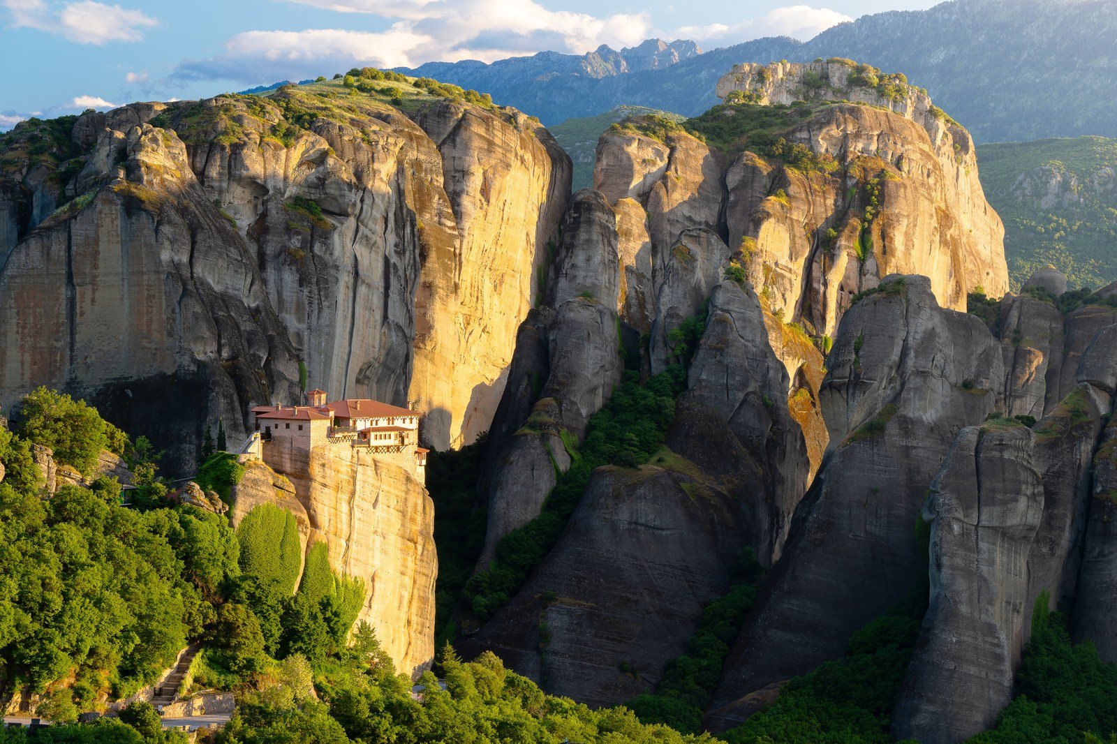
A mountain is only as vast as the frame lets it feel. Scale cues turn “a nice peak” into “an enormous peak”: a lone hiker, a tent, a small boat, a single tree gives the viewer a yardstick to measure the grandeur against. One well-placed human-sized element can transform the sense of size.
Finally — and this is the part beginners skip — you are never really photographing the thing. You’re photographing the light on it, and light direction does as much compositional work as any line. Front light, with the sun behind you, is even and true in colour but flat: shadows fall away from the camera, so texture and form collapse. Side light rakes across the scene, throwing long shadows that reveal texture and three-dimensional form — every dune ripple, rock face, and ridge gains relief. Back light, with the sun toward you, rim-lights edges and glows through translucent things like leaves and mist, separating your layers and creating silhouettes and sunstars (at the cost of high contrast and flare you have to manage).
This is the real reason golden hour is prime: the sun is low, so it’s automatically side-on or backlighting, and the soft warm quality flatters almost everything. Soft, diffused light — overcast, fog, open shade — is forgiving and ideal for forests and waterfalls, where harsh midday sun would dapple chaos across the frame. The composition you build in the field is only as good as the light you build it in, which is why landscape photographers chase conditions and times of day as hard as they chase locations. If you’re just getting oriented, the Getting started guide walks through how to plan a shoot end to end, and the same light-reading instincts carry straight over to night work in how to photograph the Milky Way.
Quick-start checklist
- Find a foreground anchor and shoot it close with a wide lens to build depth across foreground, midground, and background.
- Look for a leading line — road, river, shoreline — that runs from an edge toward your subject; favour diagonals.
- Give the eye one clear focal point and balance any off-centre subject with visual weight on the opposite side.
- Try thirds first, then break to centre for symmetry, reflections, or a deliberately isolated subject.
- Set the horizon low for a big sky, high for a strong foreground — almost never dead centre, and always level.
- Subtract before you add: change angle, focal length, or position until only what matters is in the frame.
- Shoot in side or back light for texture and separation, and add a scale cue when you want the scene to read as vast.